Wednesday, November 12, 2014
Tuesday, October 14, 2014
When my dear friend, Warren
Watson, decided to start up his own counseling center, he graciously let me
take a stab at developing a logo for his business. He wanted something that would convey a sense of
peace, serenity, trust, and a feeling that you were in a "safe
haven". Inspiration for the name “Deep Haven” came from this idea of a safe haven
combined with the fact that the center is located near Deephaven, Minnesota. Mr. Watson liked the idea of using a leaf as
part of the logo. With the center being
founded on Christian principles, he also wanted to incorporate a cross as a subtle
part of the graphic. Deep Haven started up in January of 2013 and has been
growing ever since. Mr. Watson has since hired an additional counselor to
meet the overwhelming demand of a good, solid, Christian based counseling center. Thank
you, Warren, for allowing me to be a part of such an important and exciting
venture!
Wednesday, July 30, 2014
Naturally if my husband needs his business logo redesigned, I would be the one to do it! It had been about 10 years since I'd done the previous logo, so it was time for some freshening up! Being that the business name is so long, my solution was to stack the words on top of each other - keeping everything nice and compact. Of course with the new logo came new polo shirts! What a great excuse to give Harry, our child #2, a little modeling job!
Monday, July 28, 2014
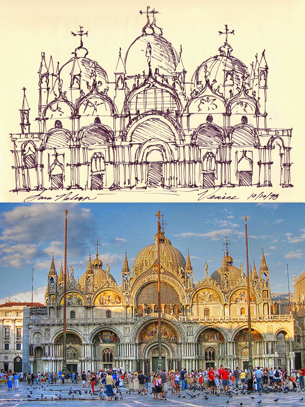
When I started this blog, the intent was mainly to showcase some of my graphic design projects as well as photography I've done more recently. But I thought I would stray for a moment and share some of my artwork from college. These are a few excerpts from my sketchbook when I attended Iowa State University's Rome Study Abroad Program in the fall of 1998. My sketchbook served as a sort of "illustrated" journal of my travels throughout Italy. I saw many great works of Italian art as well as architecture. I have highlighted a few of these sketches alongside the original artwork/architecture they were sketched from. Thanks for perusing!
Saturday, July 26, 2014
Misti Munson, owner of Sassy Cat Kitty Care, came to me in need of a logo for her new business.
Her vision was to have a cat be a part of her logo and to have the cat's tail form the "S" in "Sassy".
Misti also wanted the cat in the logo to resemble her own cat, Sylvester, so we added the white spot on her tummy.
We were both very pleased with the end result!
Friday, June 27, 2014
RBC's former worship director, David Ward, came to me to format this Gospel tract. Along with formatting, I also selected/or created the imagery for the illustrations. This is a portion of the finished product that was published by the church in 2009. Pastor Ward, who wrote the tract, uses the word Gospel as an acronym to explain the meaning of the Gospel. It was very rewarding project to be a part of!
Thursday, June 26, 2014
Subscribe to:
Comments (Atom)


